Data visualization in journalism
Hardly any other industry uses a broader range of data sets in its analyses than journalism. Every day, writers tackle new themes by presenting an overview and preparing their opinions and findings for their readers. And in doing so, they rely on just about the entire range of analytical tools covered in the Applied Information and Data Science programme at HSLU.
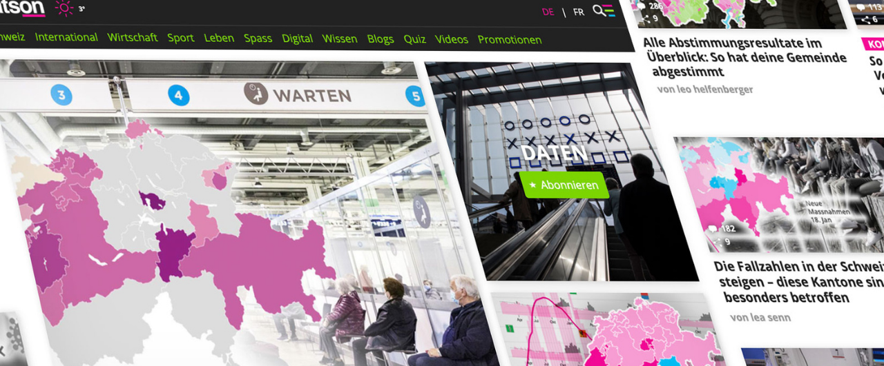
I have been working as a data journalist for the online-only news portal watson.ch for four years. In a small team, we collect and analyze data and then prepare it graphically. We often base the ideas for articles on current events and try to shed light on the perennial issues that many people tend to be thinking about. In this blog article, I would like to give you a brief insight into how we work – in the form of an insider’s view of three articles.
1. Research
Data sets are often readily available – for example, from the website of the Federal Statistical Office or by contacting someone at a company’s media office. However, for techies things become more interesting when the data must first be scraped from a source.
For example, after the meteoric rise of singer Ava Max with her song “Sweet But Psycho” in 2018 we wanted to know just how often a no-name performer has managed to land a number 1 hit on the Swiss charts out of nowhere. We didn’t have an exact data set, but the weekly hit charts are on the website https://hitparade.ch/charts/singles, which has lists dating all the way back to 1968. We thus used a Python program to retrieve the top 100 hits of each week and then stored the songs, including the artist, in a table.
The main sticking point in data cleansing involved modelling of the data structure around the performers because some of them appear in various combinations in the charts. For example, connecting the success of “Ritschi” as a solo artist with his role as the lead singer of the band “Plüsch” is impossible unless you know that he has both roles. Some artists, such as “Remady & Manu-L,” often perform as a duo, but they sometimes also perform separately. Does this mean you should include them as joint or as individual performers in the analysis? Not least due to time constraints, we did not evaluate artists separately when they collaborated with others but talked with music experts instead, who told us that difference is of hardly any consequence for our research.
Our analysis later showed that Ava Max became the fourth female artist in 2018 to climb to the top of the charts in five weeks or less, and this after never having been on any chart before. The following graph shows that the same phenomenon happened at times previously. Some well-known artists are highlighted in magenta to make the findings easier for the reader to grasp.
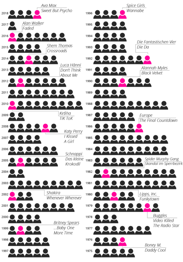
You can find the whole article here: How Ava Max reached the top of the charts in a matter of days (and how it tookP!nk took 6 years)
2. Analysis
While we often get an overview of simpler data sets directly by using Excel or Google Sheets, Python comes in handy when working on larger or more complex data sets. We used a Jupyer notebook to document our steps because this has the great advantage of enabling us to use the code again later with a new dataset, making it possible to update or republish an article within minutes.
This advantage proved useful also during the Corona pandemic, for example when entering the latest data on case numbers, deaths, hospitalizations and vaccinations, etc. in Switzerland via an interface from the Federal Office of Public Health. In some cases, it may still be necessary to calculate the average values over one or two weeks from the data. And the date column may still need to be adjusted, depending on the data source. For example, only the calendar week appeared, which meant first having to convert it with Pandas before being able to process it.
We may also need to be able to combine different data sets. This allows us to answer the most pressing questions and present the findings visually with just a few lines of code. For example, at the beginning of April 2021, we calculated the percentage of fully vaccinated people above the age of 80. From the visual analysis we could see that the cantons of Zug, Geneva and Uri were already way ahead, having vaccinated well over half of its octogenarians at that time.
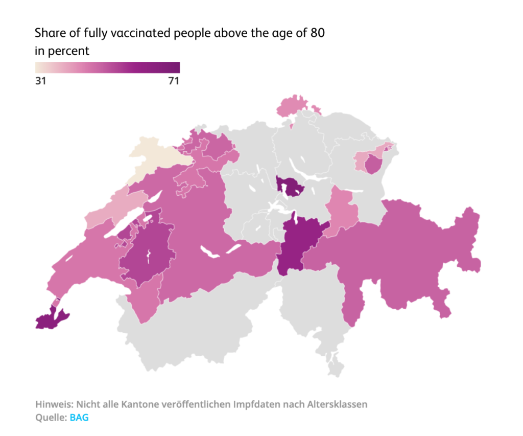
You can find the complete article here: These cantons have already vaccinated the most 80-year-olds
3. Visualization
Once we have extracted the insights from the data, we face the most challenging task when we ask ourselves what’s the most intuitive way to convey the information to the reader. After all, we know from experience that digital attention spans tend to be short these days. 🙂
So, when visualizing content, it’s often necessary to make a lot of sketches and drafts before we finally arrive at a satisfactory result. And it makes good sense to ask other journalists for their ideas and to study readers’ comments once the article is published.
For example, an article about the collapse of air traffic at Zurich Airport during the global pandemic required a lot of drafts. In the Domain Experience module on Geospatial Data Analysis for Smart Communities we learned how to use the QGIS geoinformation software. As the open-source tool, it helped us to import the modified data sets we received from Zurich Airport and create monthly graphs on the destinations served. When compiled sequentially in a GIF, the data shows how air traffic plummeted during this time.
London, the most popular destination in pre-Corona times, was particularly affected: In April 2020, there were just 59 flights to and from the UK capital, compared to 1,390 in January 2020.
You can find the full article here as well in case the animation would not work: https://www.watson.ch/schweiz/reisen/337021110-wie-sich-der-flugverkehr-aufgrund-der-pandemie-bis-heute-veraendert-hat
4. Publication and Analysis
As you can imagine, our data-driven journey doesn’t end here. We use A/B testing to find the best title and web tracking to analyze visitor numbers, and we then think of ways to incorporate what we learned into future articles. For more data-driven stories from watson, visit http://watson.ch/Daten.
Author: Lea Senn
Info-Events
Start your career with the MSc in Applied Information and Data Science now!
Join one of our online Info-Events:
Monday, 10 August 2026 (Online, English)
Monday, 7 September 2026 (Online, German)
Monday, 5 October 2026 (Online, English)
Monday, 2 November 2026 (Online, English)
Friday, 27 November 2026 (Online, German)
Monday, 11 January 2026 (Online, English)
Programme Information | Contact | Info-Events
Interested in the MSc in Applied Information and Data Science?
Visit our Info-Events. We look forward to meeting you!
Please contact us if you have any questions about your studies:
Tel.: +41 41 228 41 30
Email: master.ids@hslu.ch
Further links to the programme:
→ Generalist profile
→ Career profiles and study insights
→ Our Lecturers
→ Course structure and modules
→ Working and studying
→ Admission and registration
→ FAQ