Data Science: National Hockey League (NHL) – Attack is the Best Form of Defence
Professional sport is not just about sheer performance. Beneath the surface lies a vast source of data insights that can explain or even predict the course of events. In ice hockey, for example, our Applied Data Science students Keith Lawless and Jeffrey Sachs analysed and visualised the 2019 Stanley Cup Final between the St. Louis Blues and the Boston Bruins. Find out why the underdogs surprised everyone by winning.
Shortcuts:
Introduction | Heatmaps | Analysing the final | Conclusions | Info-Events | Programme-Information | Contact | Professional Data Science Portraits

Of hidden champions: NHL ice hockey game makes history
We all love an underdog story and the 2019 Stanley Cup Final between the St. Louis Blues and the Boston Bruins has given us one for the ages. The Stanley Cup is contested between Canadian and American teams and represents the elite level of the sport of ice hockey.
The Boston Bruins, one of the founding members of the NHL, were seeking their seventh Cup win and first since 2011. In fact, many of the players from that 2011 championship were still around. They knew what it took to win and the odds were in their favour. The Boston Bruins had home-ice advantage going into the best-of-seven final (meaning the first two crucial games were played in Boston, as would the seventh and deciding game if necessary). They also had the most feared scoring line in the NHL. The so-called ‘perfection line’ of David Pastrnak, Brad Marchand and Patrice Bergeron, who combined for 106 goals in the 2018/19 season.

The St. Louis Blues, on the other hand, were making only their fourth appearance in the final and were looking for their first Cup win (they are the oldest franchise not to have won the Cup). They started the year with the worst record in the league and there was nothing to suggest they could turn their season around, let alone go all the way to the final.
Winning the Stanley Cup for the first time
The St. Louis Blues not only made it to the final, they won their first Stanley Cup. So what happened? How exactly did the Bruins lose? This is, of course, a question often asked when the favourites fail. How did they fail? Sports fans and casual viewers alike rarely give the underdog the credit they deserve. This is because the difference between winning and losing is often subtle, lost in the superlatives of phrases such as ‘perfection line’.
However, there are ways to strip away the hype and emotional framing of such results – and one of them is to look at the cold, hard facts generated by the data of the sports we love. Sport generates countless data points – every event is counted and assigned attributes. We can take a high-level view of millions of events and look at the patterns to help us form more compelling narratives and ask more intelligent questions. It can be easy to say things like ‘the Bruins never showed up’ or ‘they just didn’t get going’ – and while those things may be true and feel right to us, what’s harder to conclude is why?
In ice hockey, a popular narrative is that goalies and defencemen are often key, and this is reflected in the individual awards, including prestigious individual awards for best goaltender. Contrast this with football, where the top individual award has not gone to a goalkeeper since 1963. With this in mind, we believe that St. Louis were able to upset the odds by making better use of their defenders in attack. Using data, we aim to highlight the key differences in the style of the defensive players between the two finalists, and how St. Louis used this form of attack to their advantage.
Shots and goals visualised by heatmaps – Attack is the best form of defence
So how are goals scored in ice hockey? To help us understand, let’s take a look at all the shot and goal events from 2018/19 and visualise them on a heatmap. During the course of a game, there can be hundreds of different types of events, many of which are measurable. These events can range from the time an individual player spends on the ice, their average position on the ice, to the coordinates of every pass, shot, goal and assist. By filtering out just the shots and goals, some interesting patterns begin to emerge. Let’s take a look at the season in question – 2018/19.
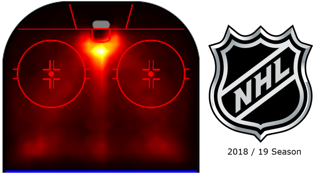
Areas of higher intensity colour intuitively represent areas of the ice where more goals and shots are scored. This heatmap can be very intuitive, even if you have only watched a hockey game for more than a minute. More shots and goals from close range.
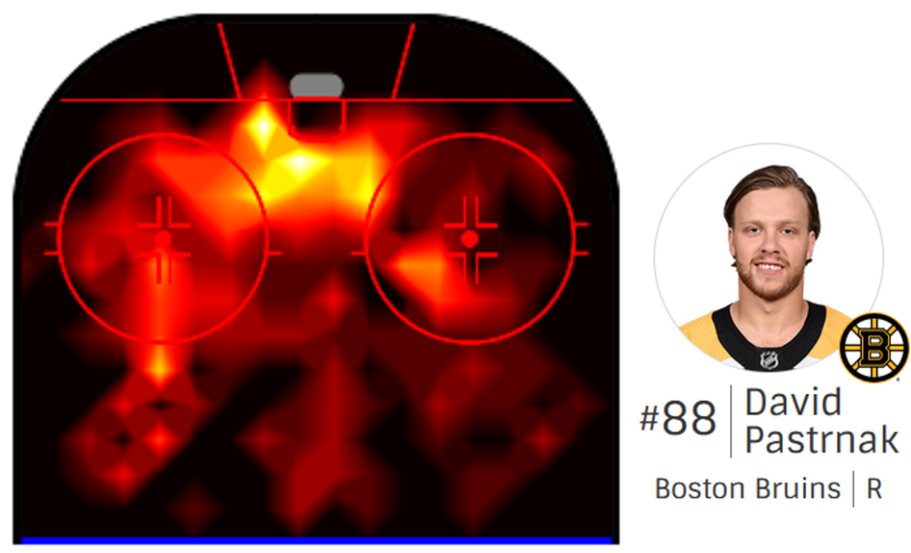
Unsurprisingly, attacking players like Pastrnak tend to benefit from the same areas. Pastrnak favours the left side of the ice here. However, there are subtleties to this heatmap that we believe hold the key to the Blues’ success. Before we dive in, let’s take a closer look at the map and see what’s going on.
In this clip we see a typical low percentage play by a defenceman. As the puck is passed from the attacker back to the blue line, we see both defencemen take their positions on the points. The defender hits hard and low to create confusion, hoping that the puck will fall in favour of an attacking teammate. In this case it does, and the attacking team capitalises.
So all you have to do is score?
Defenders seem to have it easy. Guard the points, send the puck in and see what happens. However, this type of play has a low percentage and is easier to defend against.
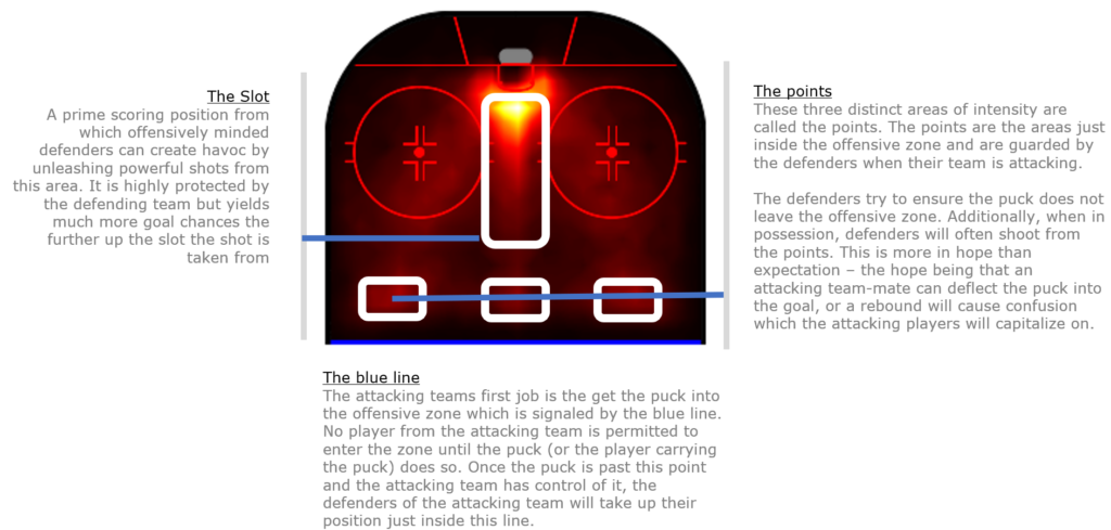
The most dangerous defencemen are those who can leave the point behind them, creating even more uncertainty for the defending team. However, leaving the point exposed comes at a price. If the attacking team loses control of the puck, an unguarded point can lead to very dangerous counter-attacks. The best defenders are aware of the risks and know when to leave the point.
Back to the final
So do St. Louis really have the more dangerous defencemen? By filtering the data on the individual players in each team’s defence, we can recreate the heatmaps above and see what these players are doing in each area of the ice.
First, the Boston Bruins

The main defenders for the Boston Bruins in the final were Slovakia’s Zdeno Chara and USA’s Charlie McAvoy. Let’s take a look at their combined heat map for shots and goals.
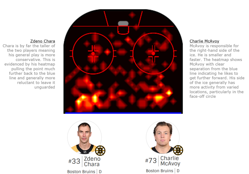
Compared to the aggregated heatmap for the league, the points are clearly defined here. McAvoy seems willing to take risks and operate further inside the blue line. His linemate Chara, on the other hand, seems to have a skate planted at the blue line. On the surface this looks like a good strategy.
Secondly, the St. Louis Blues

The Blues defensive pairing consisted of St. Louis Blues captain Alex Pietrangelo and Canadian Joel Edmundson. How do their heat maps compare?
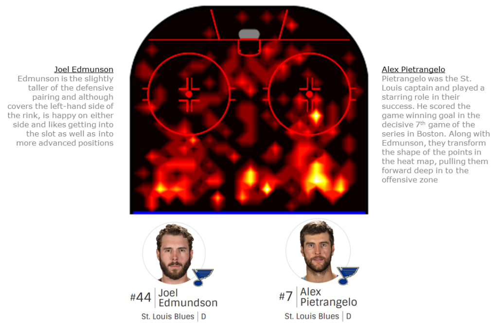
The St. Louis Blues defencemen are redefining the shape of the point. They look like arrows pointing forward into the offensive zone. In addition, both have a clearly defined third point at the top of the slot. In fact, the slot itself shows much more activity from the Blues. Pietrangelo, in particular, was a key contributor in key games. Overlaying the two heatmaps shows the contrast quite clearly.
Heatmaps in Action
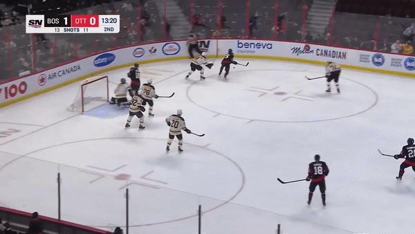
As useful as the visuals are, it helps to pick out real moments from the game to understand how these patterns emerge. To get a real sense of what’s going on in the heat map, let’s take a look at the key moment. With the final game in the balance and less than thirty seconds remaining in the first period, Pietrangelo senses and delivers the game-winning moment.

Pietrangelo knows that his opponent, Brad Marchand (circled), is tired and about to leave the ice. This is the perfect moment for Pietrangelo to leave the point, as shown by the path of the yellow arrow. Pietrangelo rushes forward, correctly anticipates the pass and scores. Marchand looks on from the bench in disbelief. A perfect line change that was anything but perfect.
The Marchand-Pietrangelo match is interesting for another reason. Coaches have the advantage of access to visuals and analysis, and they can take their time making decisions about their team. As a result, those decisions that took longer to make will manifest themselves over a longer period of time.
Pietrangelo’s decisions on the ice, on the other hand, are instantaneous and have an immediate impact. Despite the speed, there is still a process for Pietrangelo to go through. In the same way that a coach watches performance trends in his office, the players have to watch and react, even in the heat of the moment.
We can all imagine the comfort of a manager’s office. However, few of us have had the privilege of being involved in elite sport and it is difficult to relate. So what does Alex Pietrangelo’s decision-making process look like on the ice? Let’s break it down.

Conclusions
The beauty of these visualisations is that they help us to quickly see the behaviour of certain teams and players. The defensive player’s job is not as complicated as their attacking counterparts. Defencemen typically spend more time skating backwards (using different muscle groups) and can stay on the ice longer than forwards.
The attacker’s job is more complex. They use a lot more energy and usually skate faster and forward. They are under constant pressure to take hits from their opponents, which drains their energy and quickly affects their decision-making. We saw this clearly with Marchand, the Bruins forward, who made a poor, tired decision to change lines with only seven seconds left.
For this reason, attacking coaches need more advanced statistical analysis than what a heat map of their forwards can provide. Forwards generate more data and require many more relevant attributes to be measured, as their energy needs to be managed more carefully. This leads to greater complexity, where statistics (although more time-consuming to produce) can provide key insights.
As we have seen, defenders have relatively less complex engagements but still generate sufficient data points. This balance between the number of events they generate and the lower number of attributes to measure means that heat maps and visuals are a more suitable tool for defensive coaches to analyse the progress of their defensive players.
Ultimately, there is beauty in simplicity. What Pietrangelo has done is made to look simple. By looking at his data and the heatmap, we can begin to understand what makes him different from other defenders. Then, by looking at video clips and breaking them down frame by frame, we can see why he does it. Ultimately, he also looked around, collected data and acted on it. His ability to do this proved to be the difference and the underdogs from St.Louis pulled off a famous victory.
Thanks to Keith Lawless and Jeffrey Sachs for sharing this very interesting Data Science story with us.
Info-Events
Start your career with the MSc in Applied Information and Data Science now!
Join one of our online Info-Events:
Monday, 10 August 2026 (Online, English)
Monday, 7 September 2026 (Online, German)
Monday, 5 October 2026 (Online, English)
Monday, 2 November 2026 (Online, English)
Friday, 27 November 2026 (Online, German)
Monday, 11 January 2026 (Online, English)
Programme Information | Contact | Info-Events
Interested in the MSc in Applied Information and Data Science?
Visit our Info-Events. We look forward to meeting you!
Please contact us if you have any questions about your studies:
Tel.: +41 41 228 41 30
Email: master.ids@hslu.ch
Further links to the programme:
→ Generalist profile
→ Career profiles and study insights
→ Our Lecturers
→ Course structure and modules
→ Working and studying
→ Admission and registration
→ FAQ